Seller Storefront
A new product that had to earn trust before it could earn revenue.
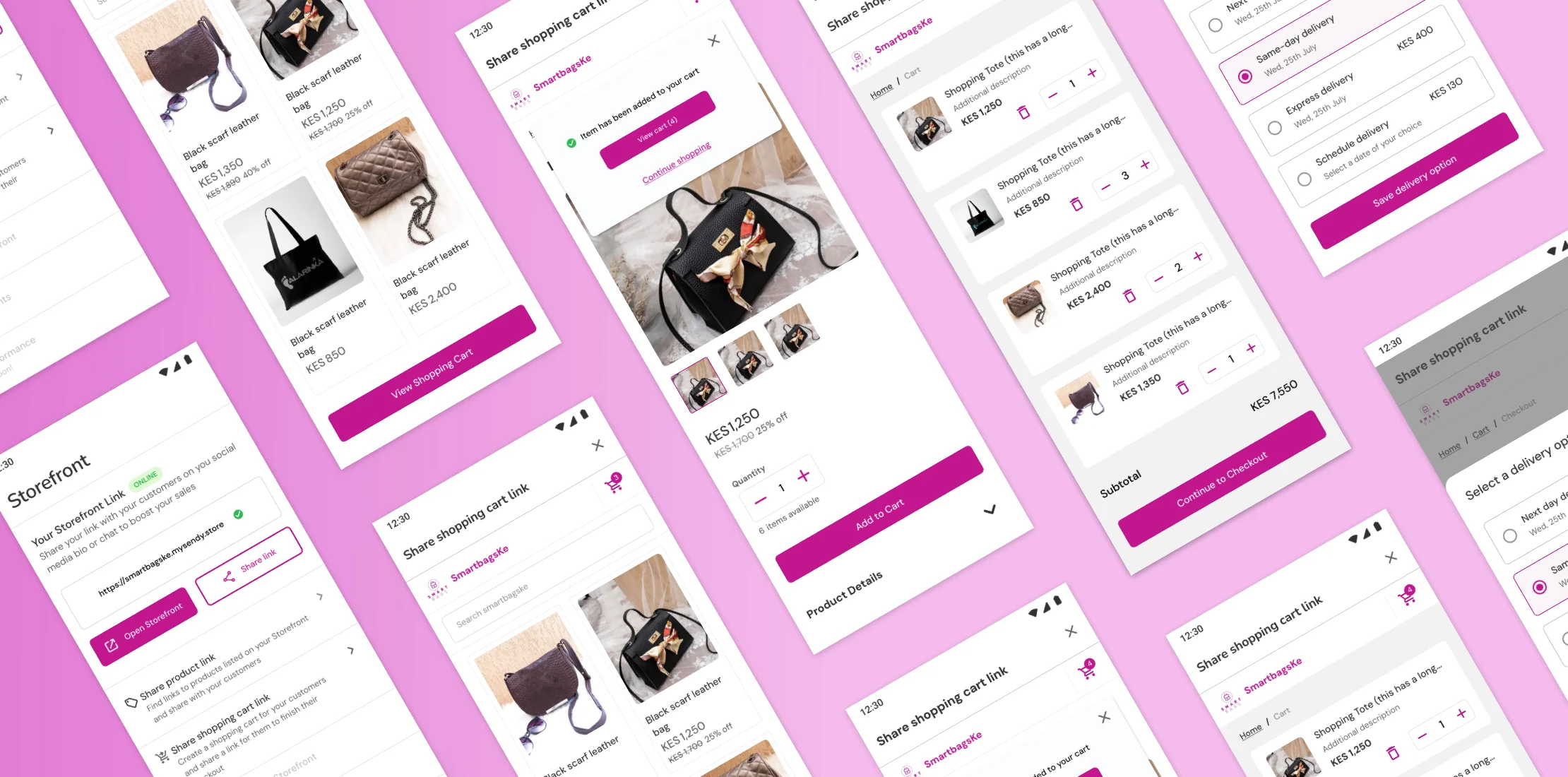
A year after launching Sendy Fulfillment, sellers had adopted warehouse storage because it cut delivery times and simplified their operations. That adoption created the next opportunity: help sellers move from stored inventory to completed sales without extra manual work.
The concept was a self-checkout storefront — sellers publish a product page from their warehouse inventory, customers buy directly, Sendy handles delivery. The full sales loop, automated.
This wasn't a "design a storefront page" brief. The risk was building something that didn't match how sellers actually build trust, set prices, and close payments in the real world.
Before we could design anything, we needed to validate: would sellers trust Sendy to collect payments on their behalf? What payment options were non-negotiable? What needed to be configurable for sellers to run a real business through this? And what was the smallest version that would still work in-market?
Because this was a new product concept with no existing user behavior to reference, I pushed for a demo-first approach — prototype quickly, test with real sellers, let their feedback define the backlog.
First round (5 sellers): I built a rough mobile prototype and tested the core flow. Setup and checkout felt intuitive, but sellers wanted fewer steps to get live. They were excited about Sendy collecting payments. Some wanted branding customization.
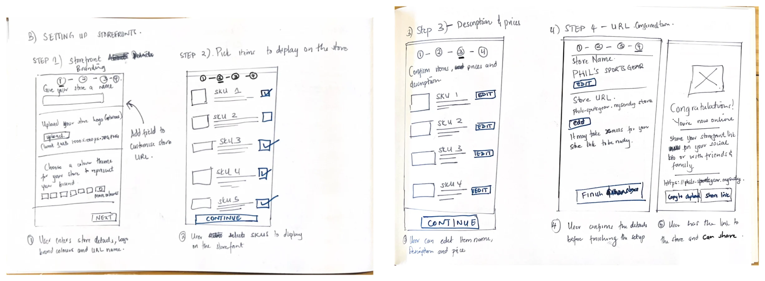
What changed: we tightened the flow around momentum — publish first, configure later — and anchored the product around payment collection as the core value.
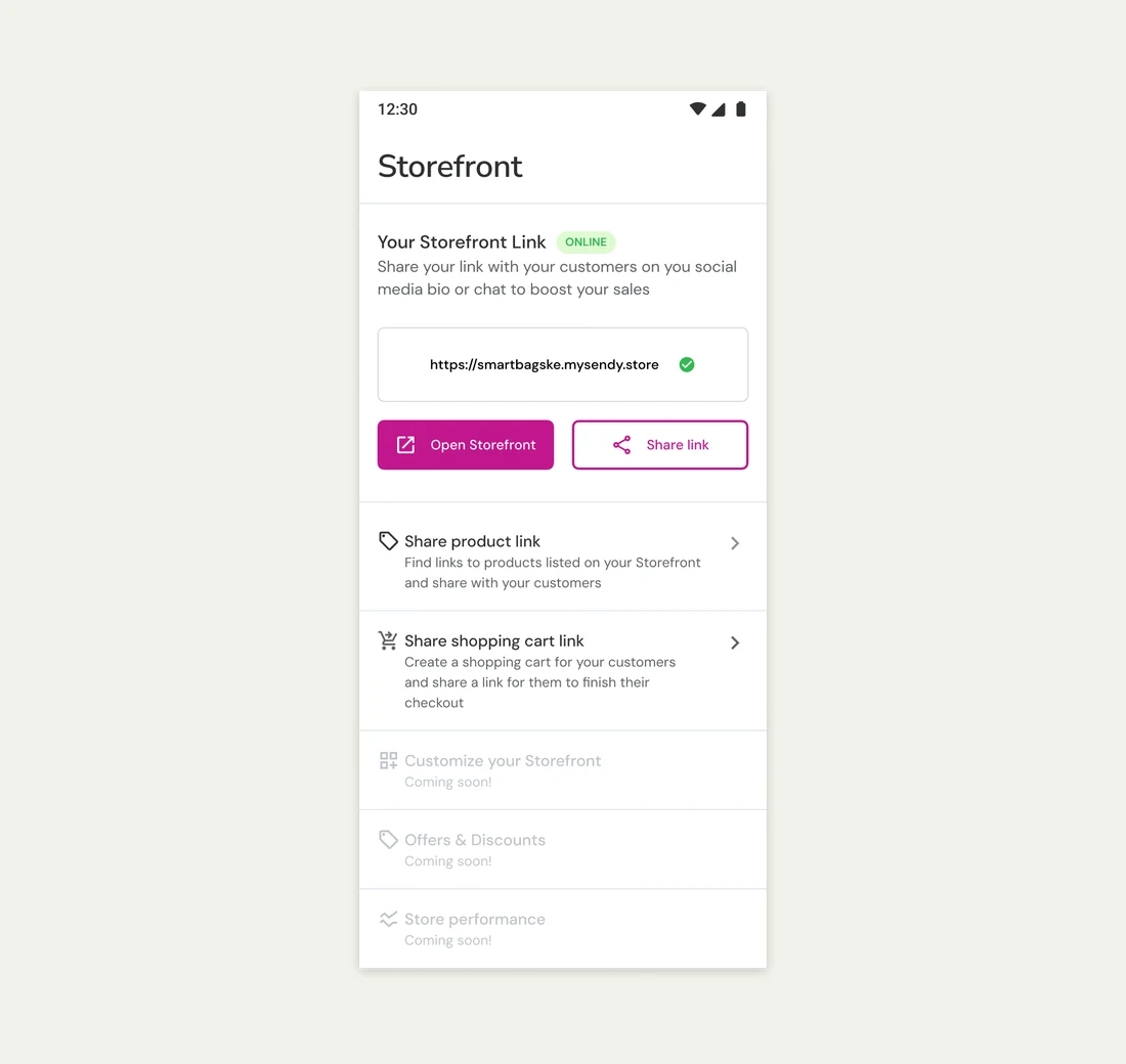
Second round (20 sellers): With more confidence in the direction, we tested a higher-fidelity prototype to shape the first release. This round surfaced harder truths: Payment on Delivery (cash or mobile money) was essential for customer trust. Sellers wanted to pass fulfillment fees to customers, but pricing configuration would be expensive to build. Discounts and bundling weren't extras — they were how sellers actually sell.
This project became a sequence of product decisions, not a UI exercise.
Optimize for seller momentum, not completeness. Reduce steps. Get sellers to a shareable storefront fast. Configuration could come later.
Treat trust mechanisms as core infrastructure. Payment on Delivery wasn't a "phase two" feature. It was foundational to whether sellers would adopt the product at all.
Separate "must-have" from "expensive-to-build." Pricing configuration was important, but we named the dev cost honestly and planned it intentionally rather than sneaking scope into v1.
Bake growth into the product. Discounts and bundling weren't feature requests — they were how sellers drive revenue. Designing without them would have been designing for a market that doesn't exist. Offers and discounts needed platform-wide backend support from other teams, so they stayed high priority but blocked. The Storefront tab shows them as coming soon.
The final design included a desktop and mobile storefront where customers could browse and order, and a new Storefront tab inside the Sendy Fulfillment app for sellers to manage their catalog, customize their page, and share links.
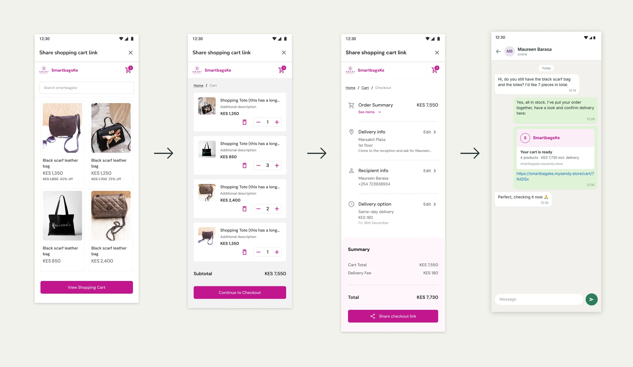
Shared carts. Sellers were already taking orders from buyers over chat and closing them by hand. We gave them a way to do it faster: build the cart, send the customer a checkout link, and let the buyer complete the order. The buyer keeps full control of the cart items during checkout.
The product was handed off for development but never released. Layoffs and shifting business priorities at Sendy killed the project before launch.
Even without a release, the work validated what a storefront needed to be viable in this market — trust, payment flexibility, lightweight setup, and seller-controlled pricing. That clarity was the real output.
Involving sellers early and often kept us focused on problems that mattered to them. Without that signal, we would have built something that looked good but wouldn't have been adopted.
An internal tool had the right data but the wrong structure. I redesigned it around how operations teams actually work.
View case study 2022Introducing bank transfers as a payment method for Nigerian merchants who didn't trust card payments.
View case study 2021Replacing four separate onboarding tools with one centralized KYC system across four countries.
View case study